GK Tabs is a simple widget which can be used for displaying other widgets in the tabs:
The configuration of the widget is really simple:
The most important option is the Tabs source – this option specifies the sidebar used as the data source of the widget. When Tabs plugin is active three special widget areas are created – GK Tab I, GK Tab II and GK Tab III – these widget areas don’t exist on the theme and they can be used in the GK Tabs widget to avoid problems with the duplicated widgets.
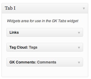
To create tabs, a user must drag some widgets to the specified in the GK Tabs widget sidebar. The titles of these widgets will be used as the tabs titles, the order of the widgets in the sidebar is also important – it will be used in the GK Tabs widget.
So, for example, in order to achieve the GK Tabs widget layout as in the first screenshot, you have to put the widgets on the GK Tab I sidebar as following:
The other options are strictly connected with the widget interface:
- First tab – it specifies the first tab displayed.
- Tabs activator event – it specifies the event used to activate the tab – it can be a hover or a click event.
- Swipe gesture – you can enable/disable swipe on touchable devices
- Navigation buttons – you can enabe/disable navigation buttons
- Tabs position – tabs can be placed at the top or bottom of the widget
- Auto animation – the GK Tabs widget can autoanimate the tabs when this option is enabled. Then, the time between tabs animations is defined in the animation interval option.
- Animation speed – time of the transition between the tabs – defined in miliseconds.
- Animation interval – time for the autoanimation option – defined in miliseconds
- Animation type – you can select type of animation, like opacity, scale up, scale down, etc.


