Schedule typography

The schedule is based on our custom HTML structure – it is a little bit more complex than other typography elements but it was necessary to create a proper HTML structure. We will describe the code based on the below example:


<dl class="gk-schedule">
<dt><strong>Friday, </strong>April 27, 2012</dt>
<dd>
<strong>10:00-12:00</strong>
<div class="gkcol1">
<div><span>Registration</span></div>
</div>
</dd>
<dd>
<strong>12:00-14:00</strong>
<div class="gkcol2">
<div>Location:<strong> San Jose, Scene 1</strong><a href="#">The Born This Way Ball</a> <small>Lady Gaga</small></div>
<div>Location:<strong> San Jose, Scene 2</strong><a href="#">Battle Born Tour</a> <small>The Killers</small></div>
</div>
</dd>
</dl>

As we can see the structure is based on the definition list (dl) with class gk-schedule. The definition term elements are used to create the date (you can highlight words in this element using the strong elements). The content of the specific hours for a day are defined in the definition description elements (dd). As it was listed – every dd element starts with the strong element – it is the period of time for a specific elements then the next element is the div with class gkcolX where is is a number from range 1-5 – here you can specify up to 5 columns with the events.

Every event can contain few informations:

  • place (as a strong element)
  • event name (as a link – usually to the longer description)
  • and small additional information (in the small element)

GK Speakers

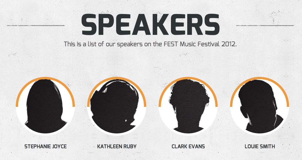
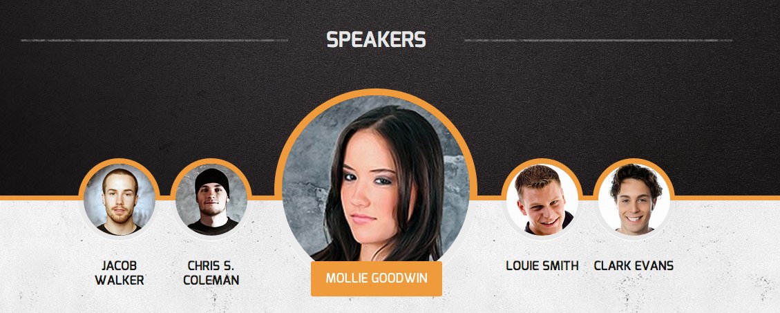
GK Speakers is a simple widget which is used to display the speakers available in the content. Please use for this widget the special widget area – speakers:

The configuration of the widget is really simple:

You have to specify the category slug for the category with your speakers – the speaker article should contain at least two elements:

  • title – the speaker’s name
  • featured image – the speaker’s avatar

Additonally you can specify the animation speed and interval between each speakers animations.

Please remember that the widget needs at least 6 speakers to proper work. If you need less amount of the speakers we recomment do use the Custom Text widget with proper structure – based on the GK Speakers widget.

GK Comments

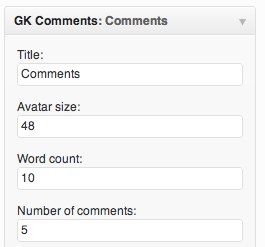
GK Comments is a simple widget to display latest comments with user avatars:

The configuration of the widget is really simple:

As you can see, there are three important options:

  • Avatar size – this option is used to specify the size of the avatars displayed under each comment.
  • Word count – this option specifies the maximal amount of words displayed in each comment item.
  • Number of comments – it specifes the maximal amount of comments to display.

The GK Comments widget uses a built-in WordPress cache system and it refreshes the cache after every comments operation.

GK News Show Pro

GK News Show Pro is a complex and powerful widget used for displaying posts with thumbnails and additional content like title, text and additional information.

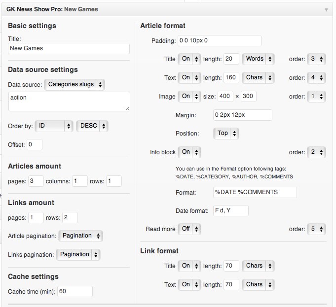
The configuration of the widget contains a lot of useful options:

Let’s start with describing the Data source section – this section contains all important options connected with selecting posts to display:

  • Data source– here, you may select one of the three values:
    • Latest posts – in this case, the text area under the selectbox should be empty – a widget will load the latest posts automatically
    • Categories slugs – for this value the text area under the selectbox should contain the categories slugs separated with a comma i.e. news,blog,sport
    • Articles slugs – similarly to the previous value – the text area under the selectbox should contain the articles slugs separated with a comma i.e. test-post-1,test-post-2
  • Order by – this option specifies the value used for the ordering and the ordering direction
  • Offset – sometimes it is necessary to display the second post from a specific category – then this option should be set to 1. The default value for this option is 0 – then, the widget will display posts starting from the first post. This option can be used only for the “Latest posts” and “Categories slugs”.

The widget can display specific amount of articles and links under the articles. It is possible to specify the amount of pages, columns and rows used to display in the articles amount and links amount options.

The cache time option is very important – it specifies how often the widget content is generated – it is safe to set it for at least 30-60 minutes or even more if the page isn’t often updated.

When the articles or links are displayed on more than one page, then the pagination will be displayed – the type of the pagination can be specified in the Article pagination and Links pagination options.

Both for Articles and Links, you can specify the format of elements displayed. Every element can be disabled by the “On/Off” switchers.

For articles and links, a user can specify the maximal length of the title and text.

Images displayed in the widget may have specific dimensions and position – the left position works only when the image is on the first position at the article – then it is displayed in the separated column. The article info block may contain few information about the article:

  • %DATE – the post date – format of the date can be specified in the “Date format” option.
  • %CATEGORY – the post category name
  • %AUTHOR – the post author name
  • %COMMENTS – the post comments amount

So, in order to display the post category and comments amount ,we will use the following format for the info block:

%CATEGORY %COMMENTS

Speakers and event pages

The Fest theme contains a custom post type – Speakers. As you can see in the back-end, there is a special tab in the sidebar:

Using this tab you can add new speakers. Please remember few important facts:

1) The speakers category layout:

is strictly connected with the category view override based on the following syntax:

category-CATEGORY-SLUG.php

in our demo we have created category Speakers with slug speakers, so we have used the following filename:

category-speakers.php

Event pages

Some pages like Sponsors or Schedule are based on the custom page template – Event page. It is a normal page but with the special header:

The title of this type is created automatically using the Event page layout.

Sponsors logotypes

The Fest theme contains a special structure for the sponsors logotypes.

First special place is located in the sponsors widget area. There you can place a following structure:

<div class="gk-sponsors">
<h2>Sponsors</h2>
<div>
<a href="#"><img src="images/demo/sponsor1.png" alt="Sponsor #1"></a>
<a href="#"><img src="images/demo/sponsor2.png" alt="Sponsor #2"></a>
...
<a href="#"><img src="images/demo/sponsor1.png" alt="Sponsor #N"></a>
</div>
</div>

The logotypes will be animated on scroll:

The second place for the sponsors is the Sponsors post – you have to create a page using the “event page” layout and then publish it. The structure for the animated sponsors is easier:

<div class="gk-sponsors-wrap">
<a href="#"><img src="images/demo/sponsor1.png" alt="Sponsor #1"></a>
<a href="#"><img src="images/demo/sponsor2.png" alt="Sponsor #2"></a>
...
<a href="#"><img src="images/demo/sponsor1.png" alt="Sponsor #N"></a>
</div>

The logotypes will be animated on the page load:

The CSS code responsible for the animation is placed in the css/extensions.css file.

Header animation

The header animation is based on our simple CSS animation engine, which uses a simple JavaScript code

Our simple animation engine is based on the data-* attributes.

For creating animation please creata a container with class gk-animation and put elements inside it. We recommend to style these elements in the css/extensions.css file.

You have to specify for every element at least two attributes: data-start and data-end. The first attribute contains starting properties for the element and these properties should be written with units. The second attribute specify which properties will be animated and what will be their final value (without units).

There are also two additional attributes: data-time and data-delay. The data-time attribute specify the time of the animation in miliseconds. The second attribute specify the time of delay for animation of the specific element (of course in the miliseconds).

The very important is fact that the content of the data-start attribute specify the start position of the animated element and all elements should be hidden at start using in example {‘opacity’: 0} at the data-start attribute.

Please remember to use the apostrophes around the property name – without it the animation won’t work!

Let’s analyze a simple example:

<div class="gk-animation" data-height="530">
<div class="gk-animation-wrap">
<h2 class="gk-scale-up" data-start="{'opacity':0}" data-end="{'opacity':1}" data-delay="200" data-time="500">Festival 21 Feb. - 27 Feb. 2012</h2>
<h1 class="gk-scale-up" data-start="{'opacity':0}" data-end="{'opacity':1}" data-delay="600" data-time="500">Festival Musico</h1>
<div class="gk-stars" data-start="{'opacity':0}" data-end="{'opacity':1}" data-delay="1000" data-time="500">* * * * * *</div>
</div>
</div>

As you can see the animation engine needs two basic wrappers – gk-animation and gk-animation-wrap. The animation will start with using opacity for animation after 200ms and with duration 500ms for the h2 element. Then (after 400ms – it is a difference between date-delay for both elements) animation will start for the h1 element also with duration 500ms. At the end the .gk-stars element will be animated.

We have also included additional class gk-scale-up which can be used for elements which will be scaled from 0 to 100% of their original size using the CSS3 transform property. We have to move this animation to the CSS code due problems with prefixed properties in the jQuery code.

It is worth to mention that some elements can be also animated in two other states of the animation – the gk-animation container changes his CSS classes – after loading the page the “loaded” class is added and after displaying the whole container the “displayed” class is added. We have used this mechanism for animating the .gka-background element in our header animation.

Responsive layout

Please remember that you have to scale down all your header elements for the tablet and mobile devices – please use for it the css/tablet.css and css/mobile.css files.

Countdown

We have implemented our own implementation of the countdown. It is very simple to implement:

<div
class="gk-jscounter gk-scale-up"
data-dateend="2-6-2013"
data-timeend="19:42"
data-timezone="+2"
data-start="{opacity:0}"
data-end="{opacity:1}"
data-delay="900"
data-time="500"
>
Counting finished!
</div>

Te idea of the counter is simple – the content of the gk-jscounter element will be displayed when the counting will be finished. To specify the time for countdown you have to specify it in the two attributes – data-dateend and data-timeend. The first attribute is used to specify the end date (in format D-M-Y) and the second attribute is used to specify the end time (in format h:m).

Very important fact – if you’re using not the UTC time, please specify the data-timezone attribute – it will guarantee that the time will be calculated correctly for all users.

The rest of the data-* attributes was described in the previous paragraphs as a part of the animation engine.
Must-hear new young local band

Nullam non neque at libero convallis lacinia. Suspendisse malesuada feugiat rhoncus. Fusce id mi sit amet dui aliquam aliquet ac a nulla. Pellentesque egestas vulputate tempor. Morbi tristique, risus vitae pellentesque volutpat, neque risus auctor tellus, quis sagittis quam.

Cras mattis consectetur purus sit amet fermentum. Nullam quis risus eget urna mollis ornare vel eu leo. Nullam quis risus eget urna mollis ornare vel eu leo. Donec ullamcorper nulla non metus auctor fringilla. Cras mattis consectetur purus sit amet fermentum. Etiam porta sem malesuada agna mollis euismod. Aenean eu leo quam. Pellentesque ornare sem lacinia quam venenatis vestibulum. Sed posuere consectetur est at lobortis. Donec ullamcorper nulla non metus auctor fringilla.

Parmalee confirmed at the festival

Nullam non neque at libero convallis lacinia. Suspendisse malesuada feugiat rhoncus. Fusce id mi sit amet dui aliquam aliquet ac a nulla. Pellentesque egestas vulputate tempor. Morbi tristique, risus vitae pellentesque volutpat, neque risus auctor tellus, quis sagittis quam.

Cras mattis consectetur purus sit amet fermentum. Nullam quis risus eget urna mollis ornare vel eu leo. Nullam quis risus eget urna mollis ornare vel eu leo. Donec ullamcorper nulla non metus auctor fringilla. Cras mattis consectetur purus sit amet fermentum. Etiam porta sem malesuada magna mollis euismod. Aenean eu leo quam. Pellentesque ornare sem lacinia quam venenatis vestibulum. Sed posuere consectetur est at lobortis. Donec ullamcorper nulla non metus auctor fringilla.

Halestorm at the Carnival of Madness

Nullam non neque at libero convallis lacinia. Suspendisse malesuada feugiat rhoncus. Fusce id mi sit amet dui aliquam aliquet ac a nulla. Pellentesque egestas vulputate tempor. Morbi tristique, risus vitae pellentesque volutpat, neque risus auctor tellus, quis sagittis quam.

Cras mattis consectetur purus sit amet fermentum. Nullam quis risus eget urna mollis ornare vel eu leo. Nullam quis risus eget urna mollis ornare vel eu leo. Donec ullamcorper nulla non metus auctor fringilla. Cras mattis consectetur purus sit amet fermentum. Etiam porta sem malesuada magna mollis euismod. Aenean eu leo quam. Pellentesque ornare sem lacinia quam venenatis vestibulum. Sed posuere consectetur est at lobortis. Donec ullamcorper nulla non metus auctor fringilla.