Video Post
This is an example of the Video Post Format:
Tip: for Vimeo videos please remember about using the HTTP (not HTTPS) protocol and the “www.” prefix.
This is an example of the Video Post Format:
Tip: for Vimeo videos please remember about using the HTTP (not HTTPS) protocol and the “www.” prefix.
Modification of administration panel content in GavernWP is very easy – it is based on JSON files which include a list of options. Thanks to it, creating new options available in an administration panel is very easy.
Options files are in gavern/options catalog in a folder connected with a currently used language. In the catalog, you will find two main files groups:
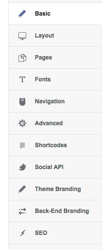 each section is described with a table in the form
 ["Basic", "options.basic", "enabled"]Each options.*.json file includes three main fields in an object stored:
Each field defined by an object including the following fields:
These fields are defined in a gavern/form_elements/standard.php file and their code was derived from a GKFormInput field. It is worth remembering that files connected with options are parsed by a gavern/form.parser.php file. Additionally, you may create your own fields types in a gavern/form_elements catalog. In GavernWP, we have included the following fields types:
The description of creating your own fields types we will describe in the further part of this article.
[a-zA-Z]{2,5}option1=10,option2=20After adding a new option, you have to remember about its support in the theme. Option value is loaded by using a get_option function of a schemata given:
get_option($tpl->name . '_OPTION_NAME', 'DEFAULT_VALUE');when OPTION_NAME is an option name from a JSON file and DEFAULT_VALUE is default value of an option which will be used when a user does not specify a value of an option given. What is important, there is a “_” symbol which you cannot omit. A prefix with a theme name is added in order differentiate values of options of different themes.
While creating a new field type, you have to start from creating a catalog compliant with a field name, e.g. CustomField in a gavern/form_elements catalog. Then, you have to create a config.json file in this catalog and fill it in according to the schemata below:
{
"name": "CustomField",
"description": "Example Custom Field",
"js": false,
"css": false,
"php": "customfield.php",
"class": "GKFormInputCustomField"
}name, description, php i class fields have to include particular values; js and css fields are optional – they allow to specify whether a field given has to use additional CSS and JavaScript code (then, a name of files from a field catalog has to be set as a value). Also, you have to create a customfield.php file including a GKFormInputCustomField class derived after a GKFormInput class.
Also, a customfield.css file must include a safety code at the beginning:
// disable direct access to the file
defined('GAVERN_WP') or die('Access denied');
Each field class has to include at least one public method – output not loading any additional arguments. This method must return HTML code of a field given. Field properties froma JSON file are available as class fields, e.g. required is available as:
$this->requiredThe second important public methid of each class of a form field is a getValue method which loads one argument – $default. Its use is optional and useful only when a value of a field given uses more than one field in the data base. Then, it is useful to overwrite this method – as an example we recommend a standard code of a WidthHeight field where overwritting a getValue method was used for storing values of two form fields in one main field created by a GKInputFormWidthHeight class.
The remaining class methods have to be created according to the needs of the author of a form field given.
A section of options connected with Social API includes five groups of options:
Options connected with sharing are the equivalent of parameters available in online editors, used for creating buttons like:
The last group of options allows to specify where they will be displayed – thanks to Include/Exclude specified articles from Social API option, it is possible to switch off Social API completely or switch on/off this functionality only for chosen posts, subpages and categories.
We specify the list of posts, subpages and categories in three last options:
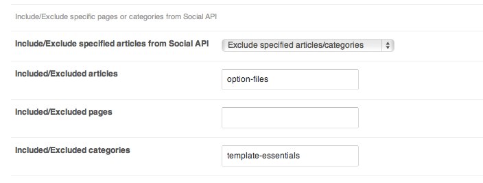 as a sequence of ID, slug or the names of posts given, subpages or categories separated with comas, e.g.
1,5,25typography,theme-settings,theme-essentialsAn advanced settings section includes settings which are connected with different aspects of GavernWP framework work:
GavernWP has an advanced panel for managing theme’s options in an administration panel. These options have been divided into a few main groups:
Also, some additional elements generated by a framework in an administration panel in some various places appear, namely:
It is also worth getting acquainted with a theme configuration with files use in JSON format:
The ability of these files edition, gives a possibility of deep interference in websites work based on GaverWP.
Basic settings allow to specify basic parameters connected with the MeetGavern WP theme:
Theme color allows to choose a color version of a theme. Here, there may appear a few various fields depending on the conent of styles.json configuration file.
Style Switcher Display is an option allowing to switch a style-switcher after an option/options of choosing theme’s styles – it is an element allowing for a website’s user to choose a theme style himself/herself.
Post sidebar informations option switches display of the post sidebar informations in the Meet Gavern WP theme.
The next option is connected with switching on breadcrumbs element on a website. There are the following options to choose from: Enabled, Disabled and Conditional rule – then, you have to set a rule using Conditional Tags and logic operators of PHP language in a Conditional rule field, e.g. a rule displaying a breadcrumbs element on the homepage and in the “Meet GavernWP” category will be in the following form:
is_homepage() || is_category('Meet GavernWP')Social icons postition specifies the position of the social icons block.
Widget display on homepage option is useful when you want to place a widget instead of entries on the homepage – then you have to switch it on mainbody widget position, place a widget needed which will replace a standard list of posts generated by WordPress.
Display author info allows to display information about its author under each post in the following form:
 Next four options are using to include/exclude specific pages or categories from showing author block.
Include/Exclude mode specifies if the specified articles, categories will be included or excluded. Included/Excluded articles specifies the list of comma-separated article IDs/titles/slugs (i.e. 2,5,34,200 or post-title1,post-title2). Included/Excluded pages and Included/Excluded categories are similar, but they specify pages and categories.
GavernWP has SEO settings built – in which allow to overwrite WordPress standard SEO settings. After switching on “Use Gavern SEO settings” option, a lot of options connected with SEO will appear:
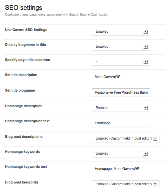 The first group of options is connected with page’s title:
The remaining options allow to switch on advanced management of keywords and description metatags:
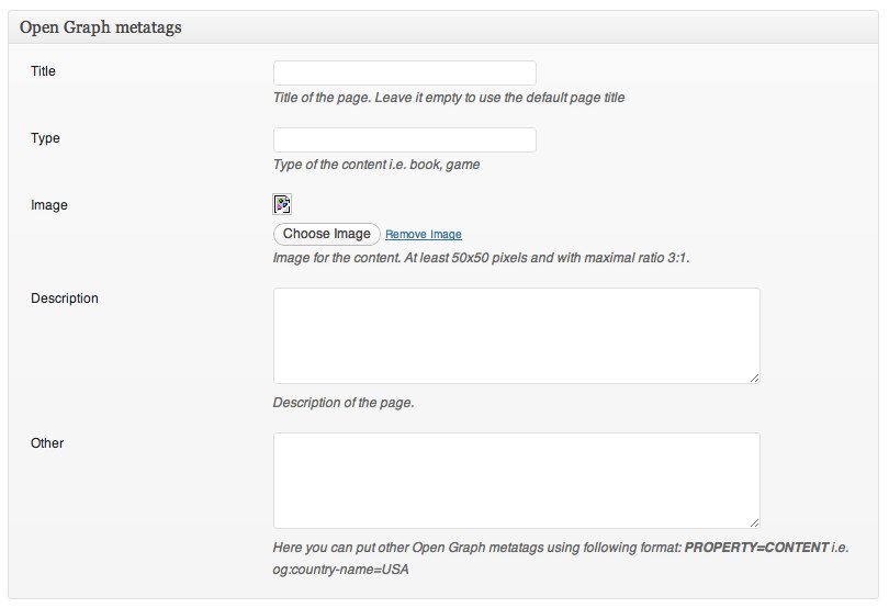
In the case of a homepage, these metatags values are specified in a SEO settings panel whereas in the case of subpages, there are two settings available for both metatags:
When you switch on these settings, under a posts editor two additional fields will appear:
If you fill them in, metatags used on one subpage with an entry will be created.
One of the key elements which has influence on website’s look is an appropriate choice of fonts used for text presentation.
GavernWP allows to choose fonts easily which are assigned to CSS selectors specified by a user.
In order to simplify support for many fonts on one page, GavernWP supports groups of fonts – each group allows to assign a font given to selectors chosen by a user:
Groups of fonts are defined in a configuration file called fonts.json. Adding a new group of fonts is very easy – it is enough to define the next object of a form:
{
"full_name": "Full name of the fonts group",
"short_name": "short name of the fonts group using only alphanumeric characters",
"description": "Short description of the font family"
}
After adding such an object, in a table included in fonts.json file, you will see the next group of fonts to manage in an administration panel.
You have to specify three basic values for each group of fonts:
Specifying of a font type is restricted to choosing one out of three fonts types:


The last stage is specifying selectors connected with a font given:
After saving the settings, the results should be visible on the website immediately – it is not required to make any additional operations.
Themes based on GavernWP framework have support for many useful solutions and technologies. The most important ones are:
Layout settings in a theme are connected with five main options:
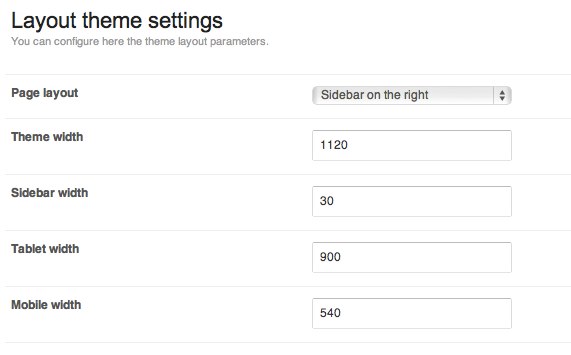 Thanks to a Page layout option, it is possible to specify a column position in page’s layout: on the left/right side or switch off showing a column completely (in this situation, you achieve the layout available via an additional subpage style – fullwidth).
A Theme width option specifies maximal page’s width – no matter what width a browser window has, page’s width will not exceed this value.
Column width is specified in per cents thanks to a Sidebar width option. Tablet width and Mobile width options allow to specify width of a browser window in pixels where css/tablet.css and css/mobile.css files are loaded.
In the case of tablet.css, modules which normally create four – column layout (max.), will appear in two – column layout which after loading a mobile.css file will change into one – column layout. Additionally, after loading a tablet.css file,a column moves under main content of a page given.
Note: all options from a Layout section are also in a live-preview editor which allows to adjust values of these options easily, thanks to a site live preview.